Overview
Hi*Ball had built a loyal following in the US and was preparing to launch in the UK. But its existing identity and packaging were designed for a different market, making it difficult to stand out and clearly communicate a brand new category: Sparkling Energy Water.
Launching in a new market wasn't about translating the brand. It was about reintroducing it. To succeed in the UK, Hi*Ball needed to feel more premium, more distinctive and instantly communicate what made it different.
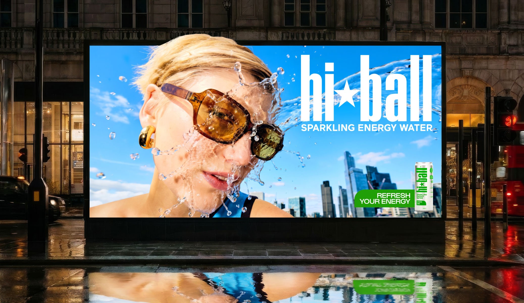
We completely reimagined the brand for its UK debut. The identity was stripped back to let the Hi*Ball name take centre stage, removing the bullseye mark and simplifying the visual hierarchy. Raw aluminium replaced flat white packaging to create stronger shelf presence, while a refreshed creative direction injected energy, clarity and confidence across every touchpoint – positioning Hi*Ball as a bold new player in its own sparkling energy water category.
Hi*Ball had built a loyal following in the US and was preparing to launch in the UK. But its existing identity and packaging were designed for a different market, making it difficult to stand out and clearly communicate a brand new category: Sparkling Energy Water.
Launching in a new market wasn't about translating the brand. It was about reintroducing it. To succeed in the UK, Hi*Ball needed to feel more premium, more distinctive and instantly communicate what made it different.
We completely reimagined the brand for its UK debut. The identity was stripped back to let the Hi*Ball name take centre stage, removing the bullseye mark and simplifying the visual hierarchy. Raw aluminium replaced flat white packaging to create stronger shelf presence, while a refreshed creative direction injected energy, clarity and confidence across every touchpoint – positioning Hi*Ball as a bold new player in its own sparkling energy water category.
Client
Year
Tilray Brands, Hi*Ball
2026
Agency: Founders Makers
Role: Design Lead
Art Direction by Katie Hamilton
Covered in Creative Review and Dieline
Agency: Founders Makers
Role: Design Lead
Art Direction by Katie Hamilton
Covered in Creative Review
and Dieline


Overview
Hi*Ball had built a loyal following in the US and was preparing to launch in the UK. But its existing identity and packaging were designed for a different market, making it difficult to stand out and clearly communicate a brand new category: Sparkling Energy Water.
Launching in a new market wasn't about translating the brand. It was about reintroducing it. To succeed in the UK, Hi*Ball needed to feel more premium, more distinctive and instantly communicate what made it different.
We completely reimagined the brand for its UK debut. The identity was stripped back to let the Hi*Ball name take centre stage, removing the bullseye mark and simplifying the visual hierarchy. Raw aluminium replaced flat white packaging to create stronger shelf presence, while a refreshed creative direction injected energy, clarity and confidence across every touchpoint – positioning Hi*Ball as a bold new player in its own sparkling energy water category.
Client
Year
Tilray Brands, Hi*Ball
2026
Agency: Founders Makers
Role: Design Lead
Art Direction by Katie Hamilton
Covered in Creative Review and Dieline